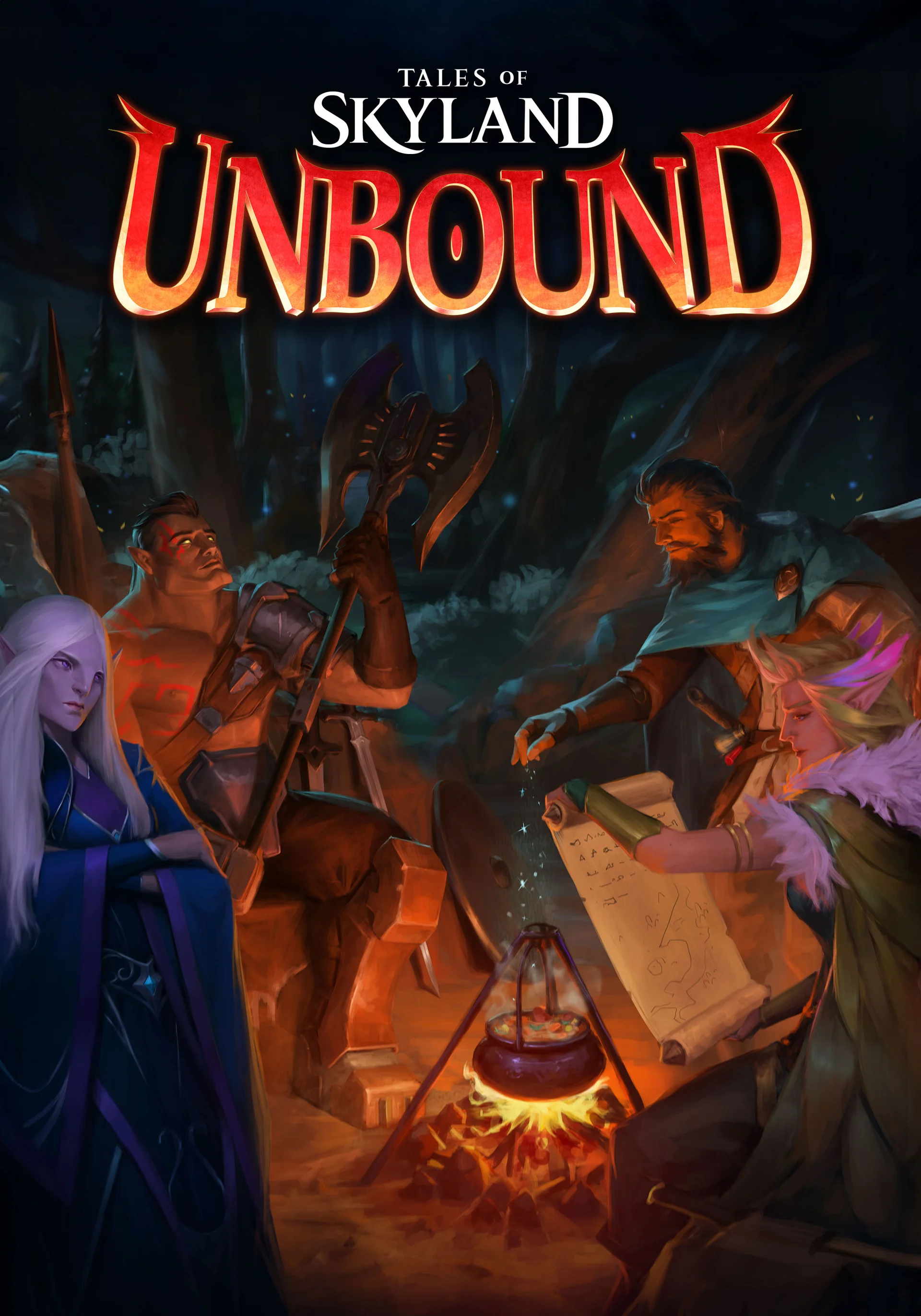
The Identity
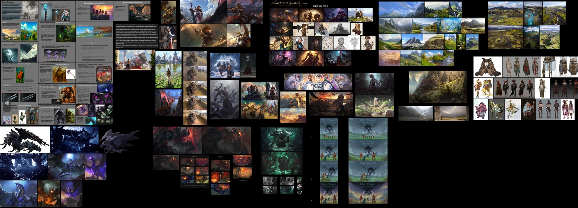
We began with the invitation of traditional fantasy game covers. The game’s vision was a story-led RPG about a party confronting a great evil, so open country mattered from the start. A dungeon entrance would have promised a different kind of adventure. Instead, we gathered references for sweeping landscapes, groups of travellers and compositions that could make a distant destination feel worth reaching.
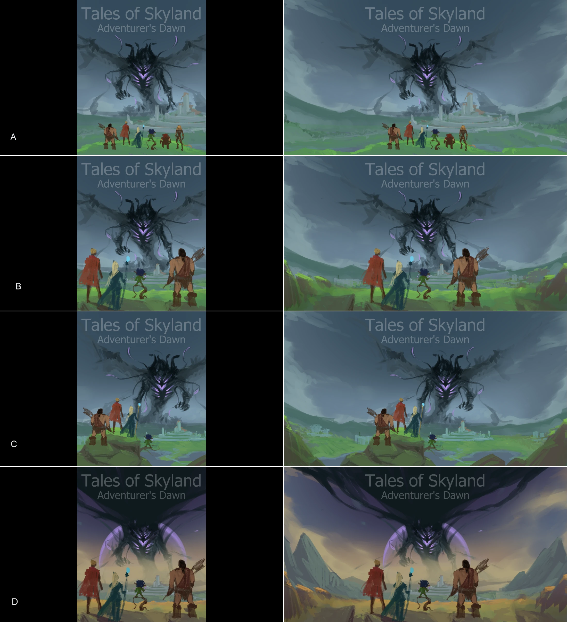
The earliest thumbnails tested large monsters, dragons and shadows above the party. They brought drama, but the upward angle made the creature dominate the scene. Our feedback to Si J was to place the companions on high ground and let them look forward and slightly down into the world. The threat could remain enormous without taking the journey out of the picture.
The Mood
Si J explored closer views of the party alongside wider arrangements of the landscape, testing the illustration in both a square box crop and a horizontal format. We needed a clear focal point in either shape, with enough room for the fields, river, houses and distant city to suggest the road ahead. These comparisons helped us decide how much weight to give the companions, the world and the storm.
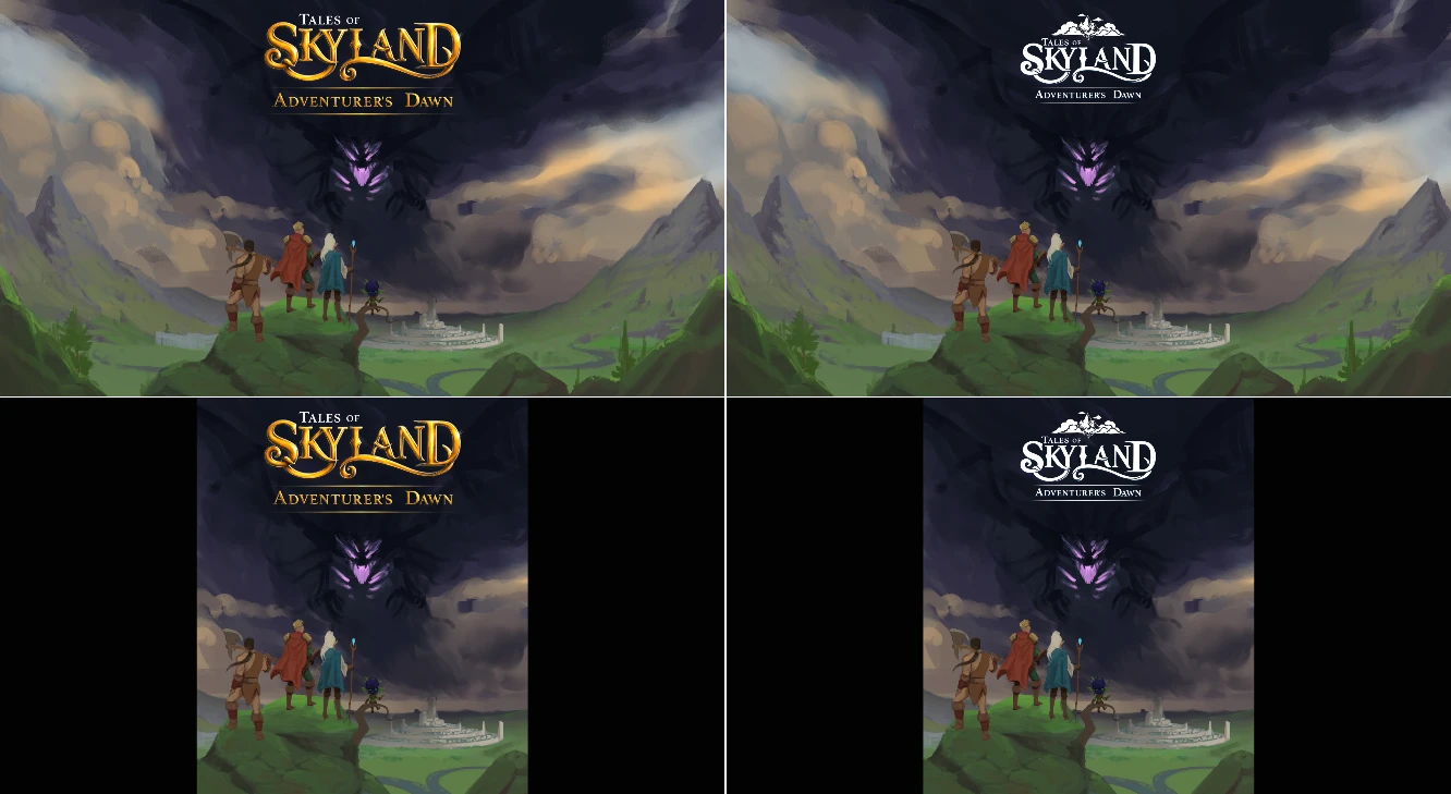
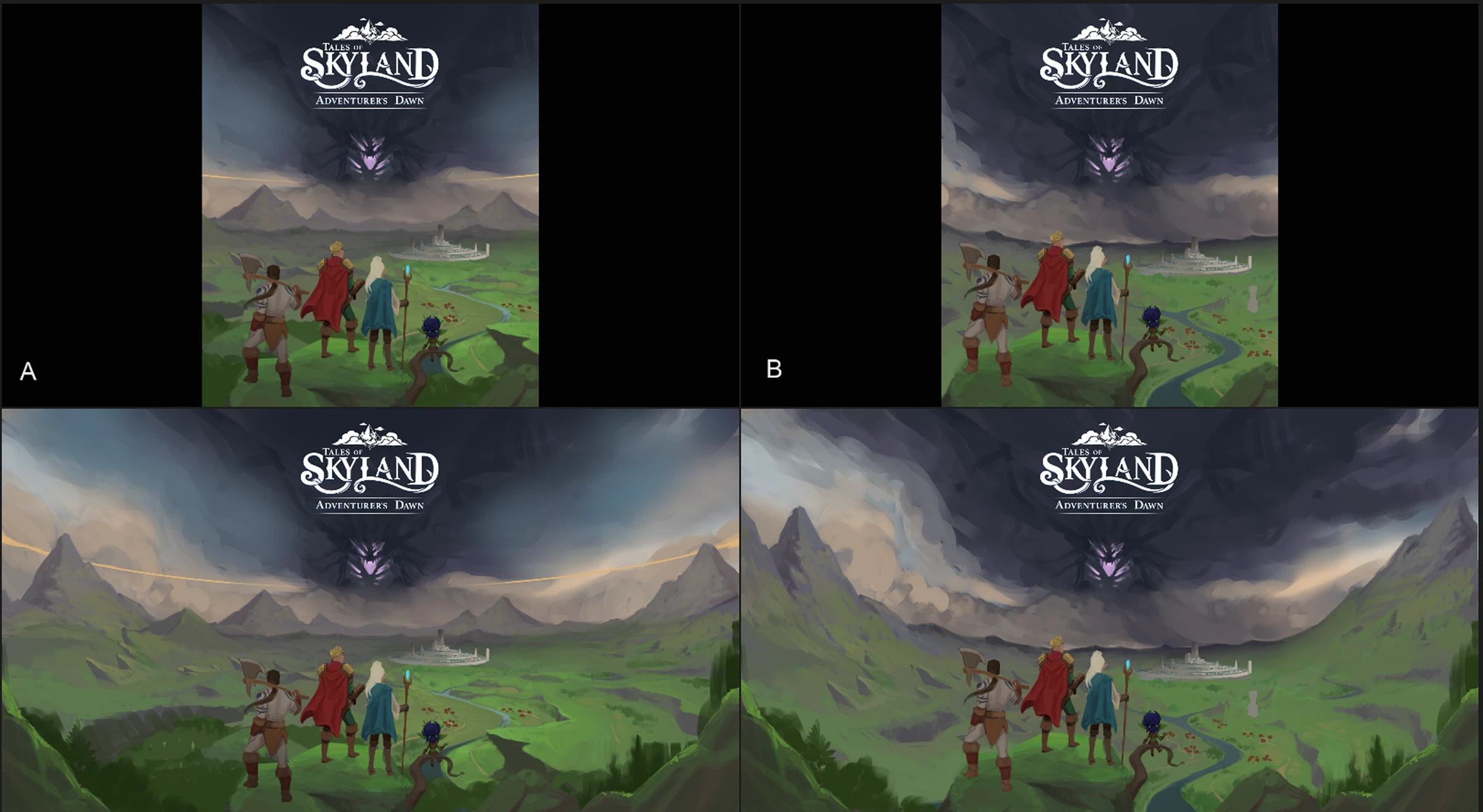
Once the geography felt right, the work moved into atmosphere. Green country opens beneath a sky that gradually gives way to darkness, drawing the eye towards the horizon. As Drako’s own design developed, the earlier monster shapes became a more recognisable threat. We chose a pose whose wing could merge into the sky, with the claws drawing around the title and violet light keeping his presence readable within the shadow.
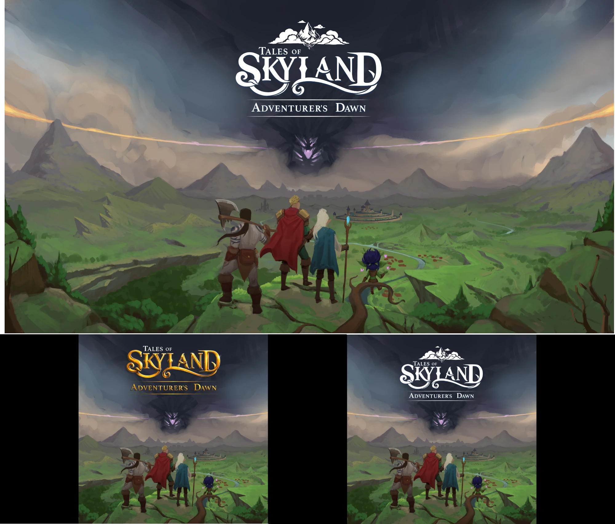
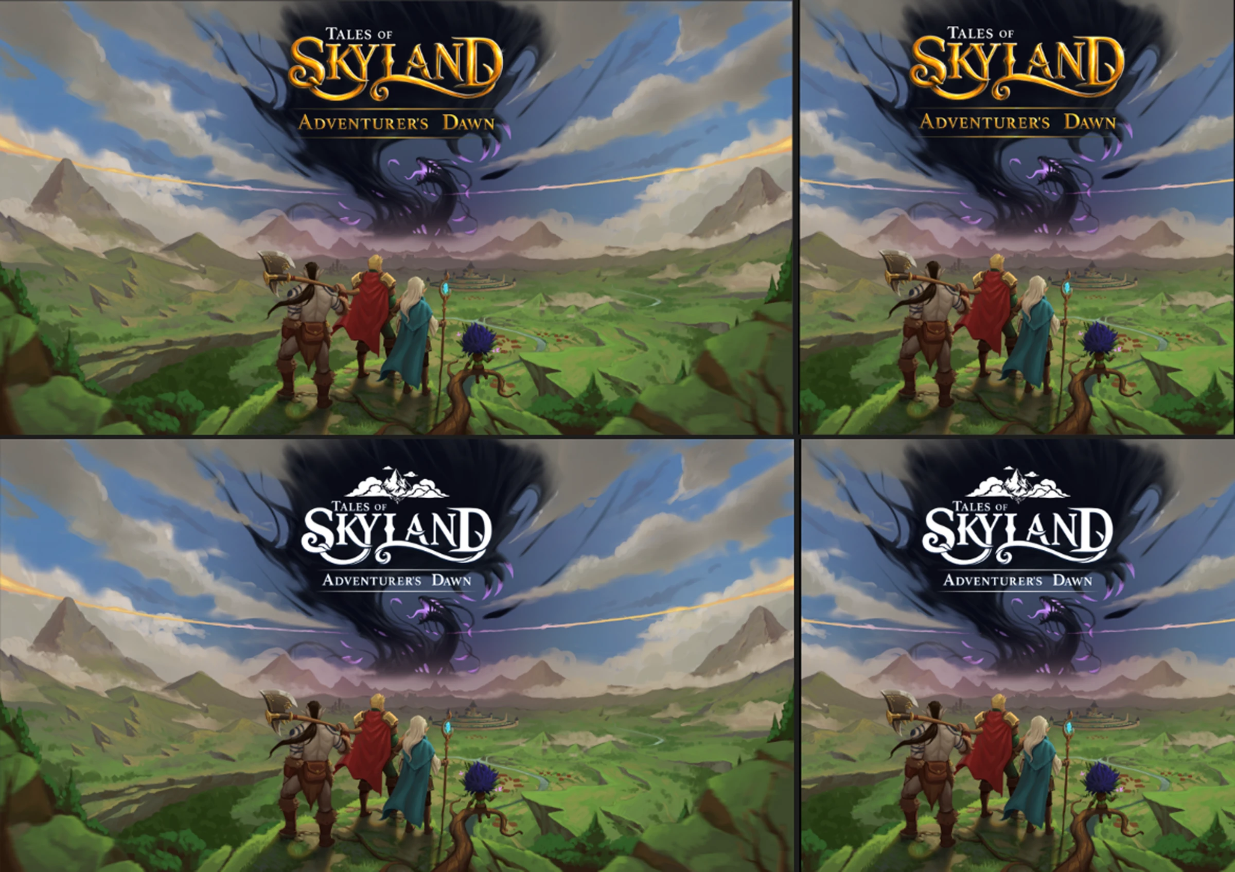
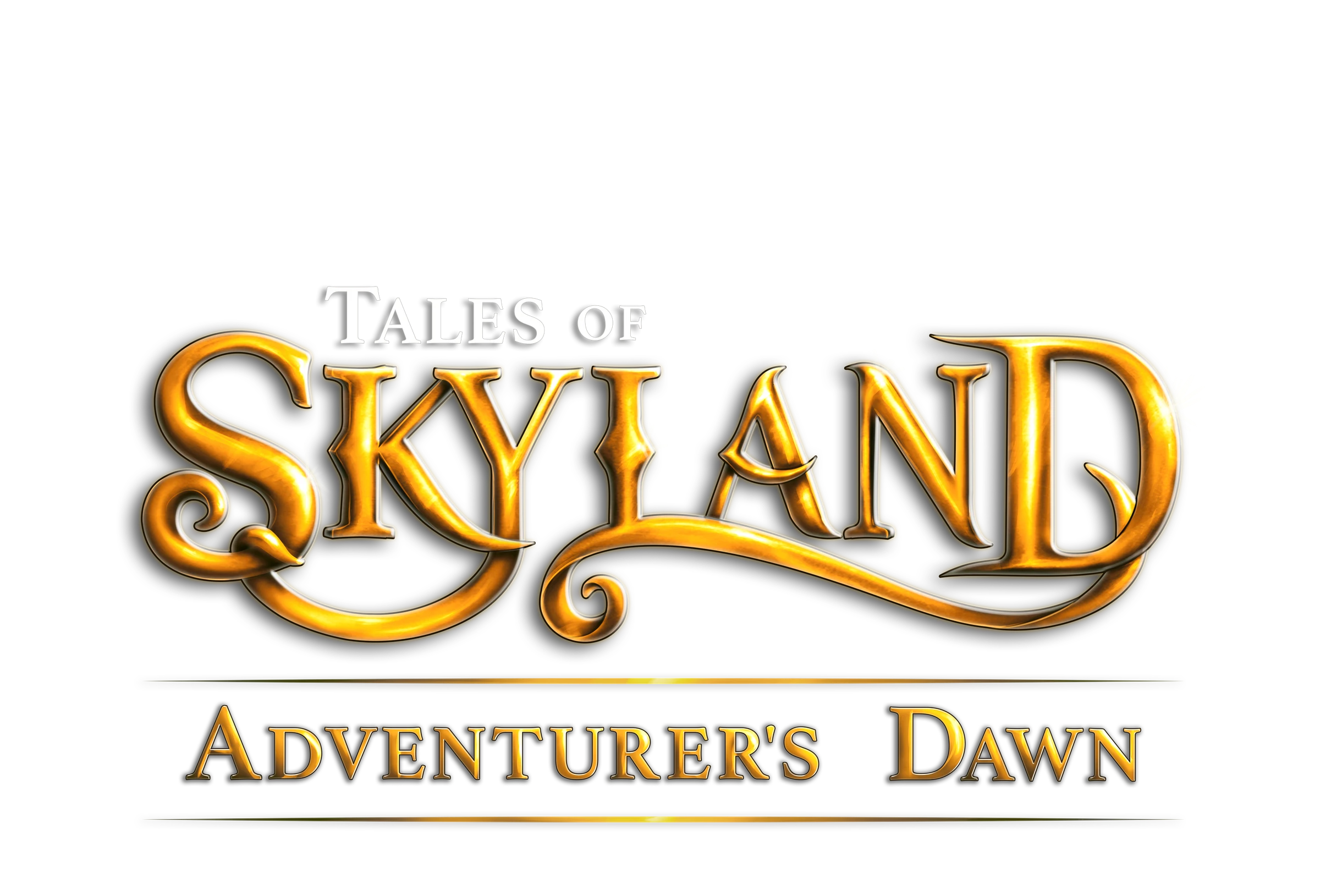
The June rendering passes developed the characters and sky before refining the fields, houses, river and distant kingdom. Gold and white title treatments were compared along the way. We wanted the warmth of a classic fantasy cover, with a title that remained clear against the growing drama above it.
The Essence
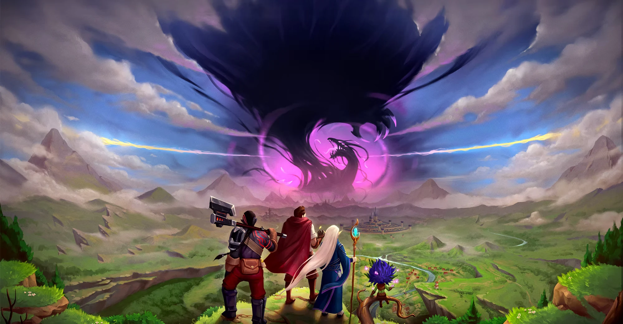
The party changed as Skyland’s identity grew. The early knight, barbarian-like Turoc and elf were familiar starting points, but we wanted companions who belonged to this world. The knight became a more casually equipped hunter. The Turoc gained forged boots, a more advanced weapon and a long braid. The elf became an Eldian with longer robes and larger ears, while the Fwlling kept the group connected to the wild.
Smaller choices brought the same care to the scene. Hanging sigil stones replaced the caster’s book, tying the equipment to Skyland’s magic. In the polishing notes, we asked for clearer roots and leaves in the foreground, deeper shadows beneath the party and fine reflected light on skin, cloth and metal. Softer distant clouds and a quieter middle ground helped separate the landscape into layers, so the view felt expansive rather than crowded.
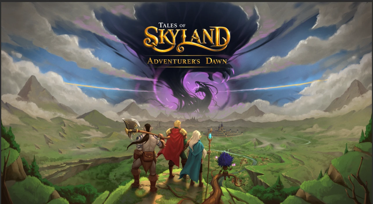
The first completed cover preserves an earlier moment in that process. Beside the later illustration, it shows how much a party’s clothing, equipment and silhouettes can change the identity of the same composition.
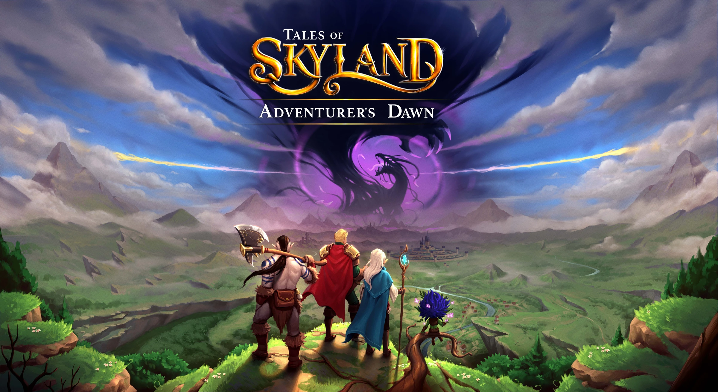
The title evolved too. The earlier painted logo carried Adventurer’s Dawn, the dawn of one adventurer. Adventurers’ Dawn gives that beginning to the whole party. The lettering also moved towards a balance of traditional fantasy character and a cleaner modern finish, while the original painted treatment remains part of the cover’s history.
Final Design
We hope you enjoyed this glimpse into the horizon waiting beyond the first step. Some journeys are too great to begin alone.
The artists behind Adventurers’ Dawn Cover


Artwork gallery
Select an image to view it at full size.